Case Study
Kirkland & Ellis Rebrand
Bringing the visual identity of one of the world's top law firms into the modern age, accurately reflecting its position as a leader in the field. The combined efforts of a newly expanded Branding & Creative team.
Client
Kirkland & Ellis, 2018-2022
Role
Copywriter, Brand Designer

Background
Kirkland & Ellis is an international law firm servicing a broad range of clients in private equity, M&A and other corporate transactions, litigation, restructurings and intellectual property matters. In 2018, the Firm launched an updated website to better reflect itself as a leader and innovator in the legal space.
Challenges
An overhaul of the Firm's branding was to follow the new website. However, the site's design and development had been outsourced externally. With certain choices already in place, we were faced with the challenge of how to further develop the brand, keeping the website's existing look and feel in mind without being stifled by it.
Additionally, visual inconsistency in materials between offices and departments was becoming an increasing problem as Kirkland continued to undergo rapid growth. We needed to unify the brand as leadership strived to adopt and promote a “One Firm” mentality.

Strategy
Our team's goal was to strike the right balance between respected institution and cutting-edge player within the field of BigLaw.
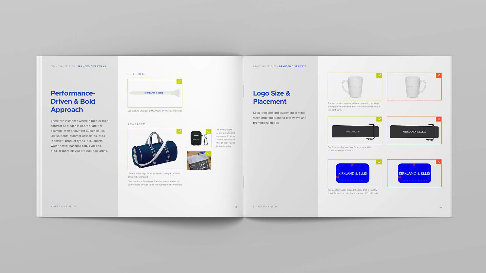
To avoid overwhelming employees with too many changes at once, the rebrand was rolled out in phases. We began with the basics: new logo guidelines, colors, typography, assets, etc. Then came collateral: ads, one-pagers, emails, and social media. Finally, once the new brand was established and embraced, pitch materials were updated.
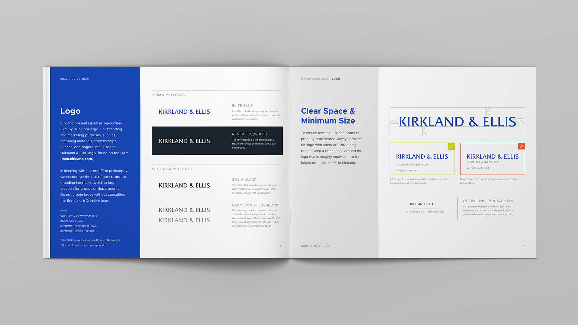
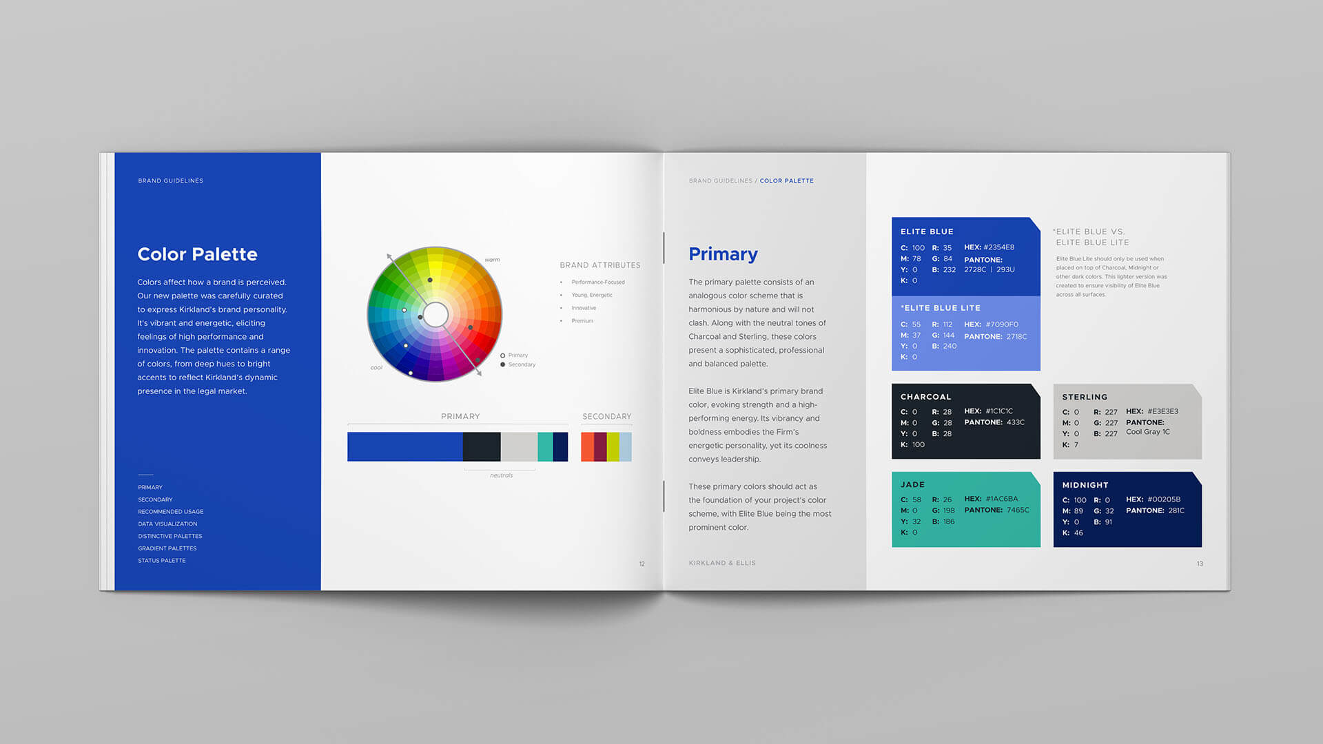
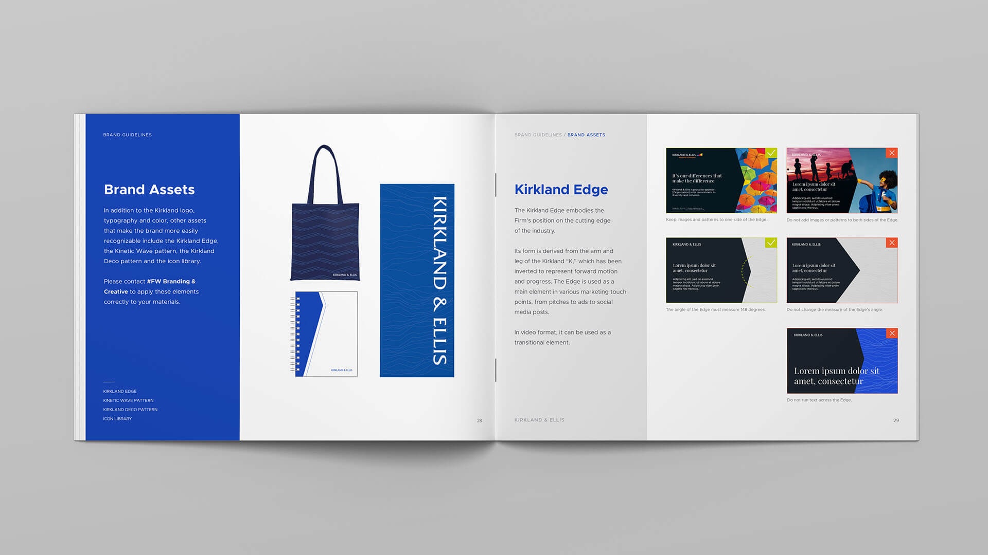
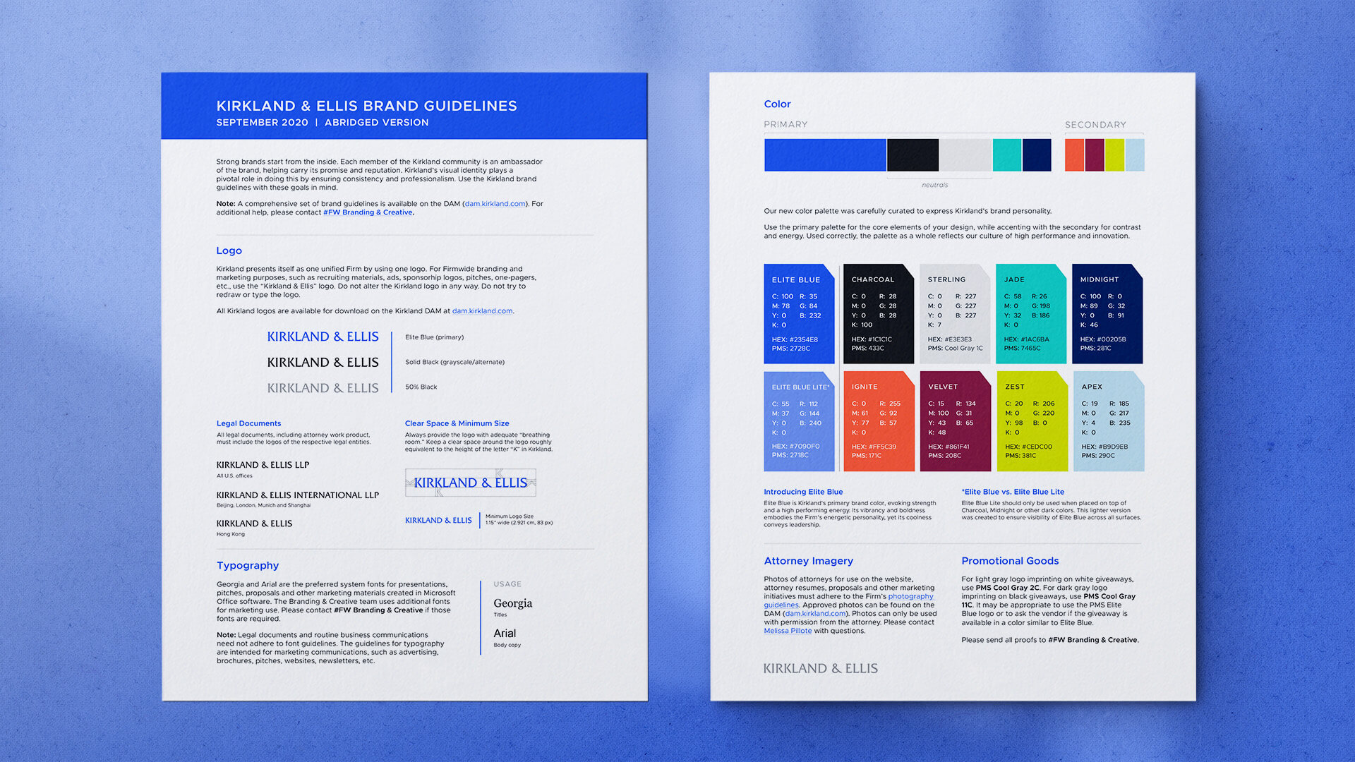
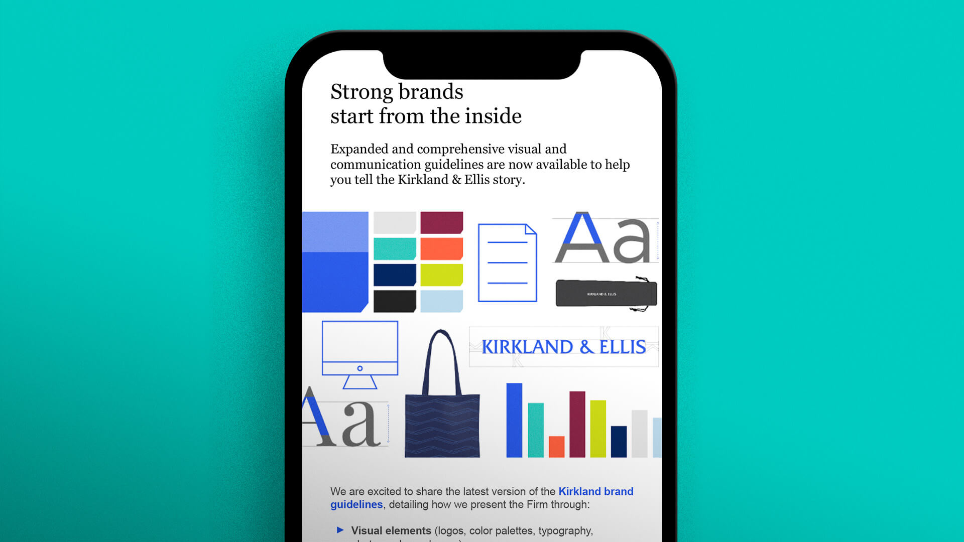
I co-developed a book of brand guidelines to document Kirkland’s evolving visual brand for the benefit of the design team, Firm staff, and vendors. Firmwide release of the completed guidelines were announced via an email campaign.
Identity
The Kirkland brand centers around sophistication, and at the same time, energy. The primary color palette revolves around the bold Elite Blue, complemented by analogous cool tones and neutrals to evoke professionalism. The secondary palette provides opportunities for contrast and vibrancy.
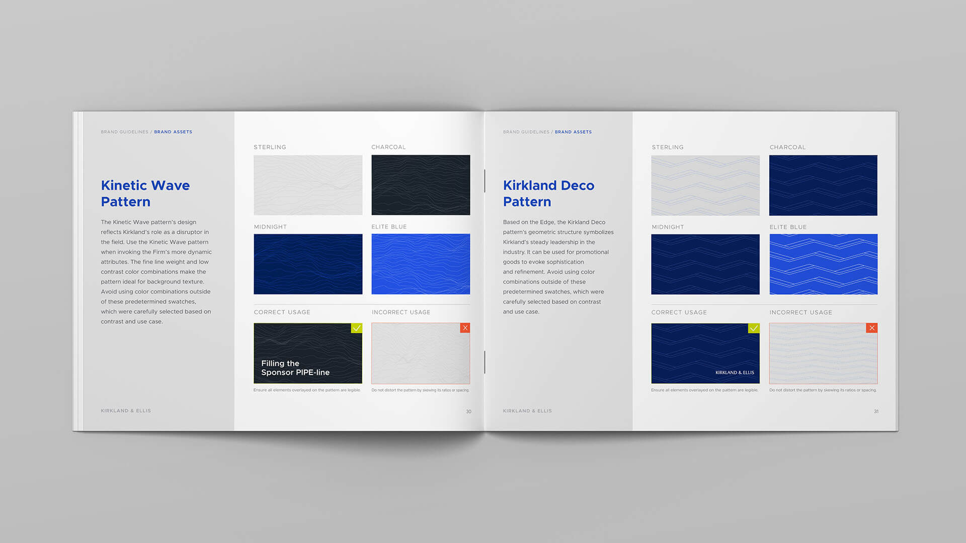
Other brand assets, like patterns, reflect the range in Kirkland's brand personality, from its position as a disruptor in the field to its steadiness in the industry.
Project Team
- Brenna Adams
- Elena Franck
- Kiley Jecha
- Aya O'Connor
- Cheryll Victuelles